Showing posts with label Leeds College of Art. Show all posts

Sunday, 20 February 2011

College Post 8: Mixed-Media Personal Work

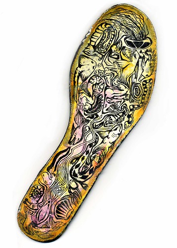
This is the last of the work that I did while at Leeds College of Art (unless some more turns up somwhere), all personal work. The first two images were created when experimenting with layering up backgrounds and illustrating over the top. The first was on the sole of a shoe and the second on a t-shirt.


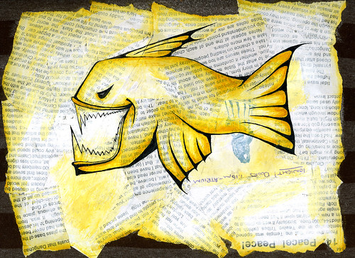
This image was created in response to a piece of photojournalism about the conflict in Georgia, the newspaper in the image is in the shape of the country.


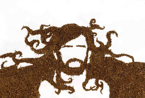
The final image is an illustration of the musician Devendra Banhart, made out of Redbush tea.

Wednesday, 16 February 2011

College Post 7: Digital Work

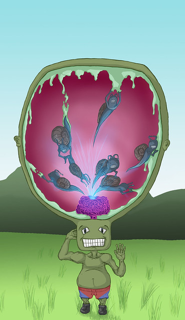
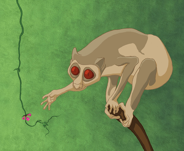
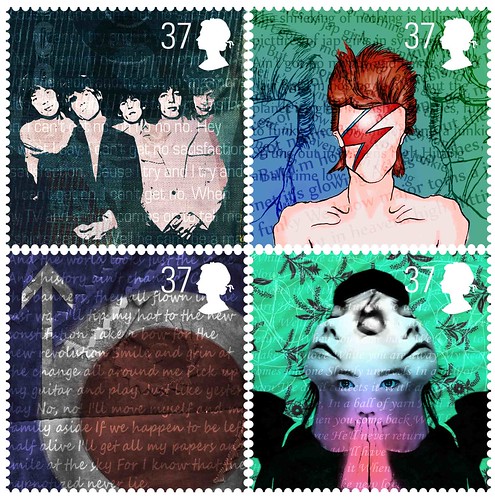
Some more personal work done digitally while I was at college. The third image was for a Contextual Studies journal and the final one was for a mini project to design a set of stamps.


College Post 6: Mixed-Media Paintings

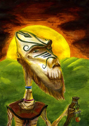
A few paintings I did while at Leeds College of Art, though not really linked to any projects set.


Sunday, 13 February 2011

College Project 5: American Gods

This was done as a response to our AS Fine Art final project at Leeds College of Art with the theme of Links and Connection. I ended up doing a book cover project for Neil Gaiman's book American Gods. I came up with two concepts for the cover, based on two separate sections of the book.

The first, was based on a section of the book where one of the New Gods appears in the form of Lucille Ball from I Love Lucy starts speaking to the main character, Shadow.


The second concept, which became my final piece, is a more abstract idea of Shadow, and his journey through the novel.

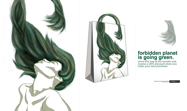
College Project 4: "Bagvertising"

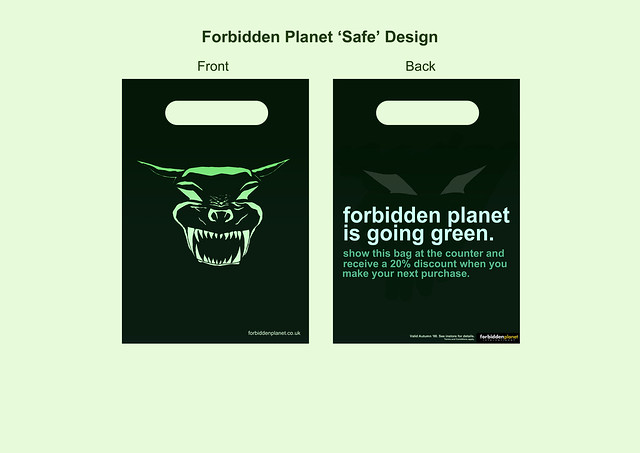
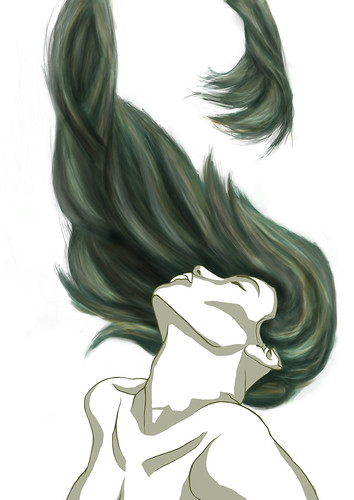
This was a competition brief we were set over the summer for Leeds College of Art, which I actually ended up winning. We were asked to produce a bag advertising a promotion for an existing brand, taking into consideration the environmental impact of bags. We had to produce one safer option and a more 'out there' design. I chose the comic book shop Forbidden Planet, with a promotion where if the same bag was used for their next purchase the customer would receive a discount. The idea was to minimise the impact of bags used by customers and to also encourage repeat purchases.

Safe design:


'Out there' design:

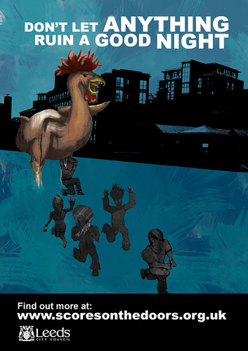
College Project 3: Leeds City Council

This wasn't a live brief, but Leeds City Council asked our class to design a poster and informative leaflet to give to restaurants about the new Scores on the Doors hygiene rating system, using their existing brand identity.


Saturday, 12 February 2011

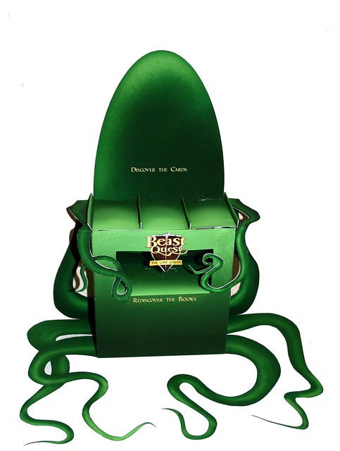
College Project 2: Brand Extension

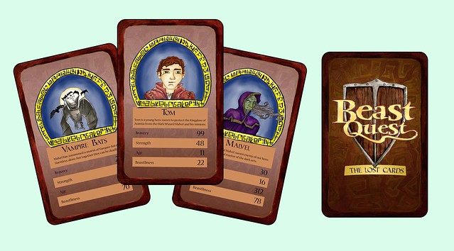
This was a project we were set in the second year at Leeds College of Art. We were asked to take an existing brand and create a new product to fit in with their existing range. I chose to make a pack of trading cards based on the Beast Quest book series, aimed at children. The Beast Quest logo is theirs, all other artwork in mine.

Maquette of Point of Sale unit for both the books and the trading cards:


Samples of the cards:

Update Post

I've recently rediscovered this blog, so I thought I'd start updating it with some of the work I've done since starting with the work I did whilst studying Graphic Design at Leeds College of Art between 2007 and 2009.

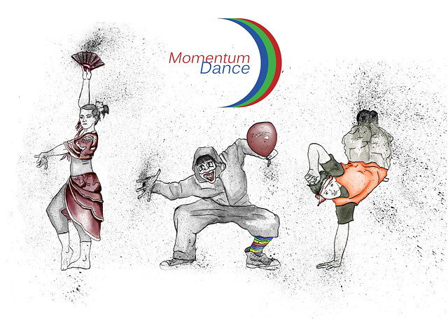
The first project I'm uploading was a live brief competition with a local dance company called Momentum Dance. They didn't end up choosing my work, but here are some of the illustrations I used in my proposed promotional material:

Monday, 3 December 2007

Unity - Ouroboros

Ouroboros by Theodoros Pelecanos, 1478

Context: 'The Ouroboros, also spelled Ourorboros, Oroborus, Uroboros or Uroborus (IPA: [ˌjʊərəʊˈbɒrəs]), is an ancient symbol depicting a serpent or dragon swallowing its own tail and forming a circle. It has been used to represent many things over the ages, but it most generally symbolizes ideas of cyclicality, unity, or infinity. The ouroboros has been important in religious and mythological symbolism, but has also been frequently used in alchemical illustrations. More recently, it has been interpreted by psychologists, such as Carl Jung, as having an archetypal significance to the human psyche.'
- Wikipedia
Actual meaning:
The symbol of the Ouroboros has meant many things to different cultural groups through the centuries. In its earliest form, it was a mythological metaphor for the cyclical nature of life, that is a reminder that everything is born and then dies (and in some cultures was then born again). In medieval times, such as when the image by Theodoros Pelecanos was created, a more alchemical view was taken of the Ouroboros and it became more a symbol than a myth.


What the piece means to you:


This piece has little personal meaning to me, however I see the symbol mainly to represent unity and as a was to illustrate how things tend to end up back where that started in one way or another. In a way, it also represents life and death (and rebirth) as a unified being and I think that this is an idea which is quite interesting.


Materials used and how they compliment meaning:
As this was an illustration in a medieval text book, I would say this could have been created using one of two methods. The first method would be to hand render it with drawing inks. The alternative would be to have created it using some form of printing press. Baring in mind the level of technology available at the time, I think it would most likely have been hand rendered, largely down to issues of cost and practicality.
As a positive note, the materials used help identify this illustration as a symbol rather than a drawing by creating clearly defined areas of flat colour that give the image a completely 2-dimensional nature. The use of the black keylines ensures that none of the original details have been lost over time, resulting in an image that is still clear today, though the colours may have faded and become less saturated.
Overall judgement on the work as a piece of communication:
This example of the Ouroboros is in my opinion, showing its age. While the symbol of the Ouroboros has been successfully updated to fit into more recent art, and the symbol itself has been given a modern edge (see below for examples), this image will only really be appropriate as an illustration in a medieval text.
The piece looks very flat and lifeless, and looks similar to crude cave paintings.


My Response
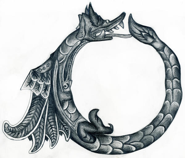
I created my response to the Ouroboros symbol using a 2B pencil on plain paper. The reason I used a graphite pencil instead of drawing inks is that I wanted my response to have more realism than Theodoros Pelecanos' representation of the Ouroboros.

LinkWithin

Related Posts Plugin for WordPress, Blogger...